
Lazy loading background images to improve load time performance
Lazy loading of images means that images are not loaded by the browser until the moment they are needed. On pages with a lot of images, effective use of lazy loading can reduce initial loading times significantly. But what about background images? They aren't loaded in the same way as a standard image tag, so we will often see a performance hit on pages with large background images. Is there an easy way to avoid this?
Lazy loading - then vs now
Image lazy loading has been implemented in many different JS libraries over the years. The approach typically was:
Instead of setting the
srcvalue of animgtag, add the image url to thedata-srcvalue.Add a class to each
imgto indicate that it is a lazy-loading candidate, e.g.class="lazyload".Attach a JS library which would bind to the scroll event, and check for when an
img.lazyloadappears near the user's current scroll position.When it does, swap the
data-srcvalue into thesrcattribute, triggering image loading.Remove the
lazyloadclass so this element isn't re-loaded when the user continues to scroll.
This approach was popular, but often had significant problems performance-wise. Binding to the scroll event was so bad performance-wise, Chrome now actively warns against it whenever this is seen in practice.
Warning of poor performance
Enter loading=lazy
The loading attribute takes this work out of the hands of JS plugins, and allows the browser to optimise it instead. Support is widespread, and means that any image with this attribute set to lazy will not be loaded until it is near the viewport. The exact distance from the viewport at which loading is triggered is handled by the browser, and incorporates signals like the user's connection speed:
On fast connections (4G), we reduced Chrome's distance-from-viewport thresholds from 3000px to 1250px and on slower connections (3G or lower), changed the threshold from 4000px to 2500px.
When applied correctly, this attribute can have a phenomenal impact on performance. Initial page load times can be radically decreased by deferring image loads until necessary. The important caveat is that this attribute is not applied to all images on the page - having images above the fold lazily loaded can actively damage user experience, as well as Core Web Vital metrics.
<img
  src="photo.jpg"
  height="450"
  width="600"
  alt="house photo"
  loading="lazy"
/>
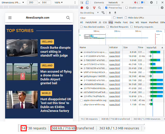
Applying this technique to an image-heavy site, we can see significant improvements in the amount of data required for an initial render. Filtering the network tab to resource type Img, on our example page we can see that there are a number of images and logos loaded - 14 images, making up 368kb of the page's initial weight.
After adding a loading="lazy" attribute to each img tag outside the initial fold, we see a significant reduction in data needed on first load!
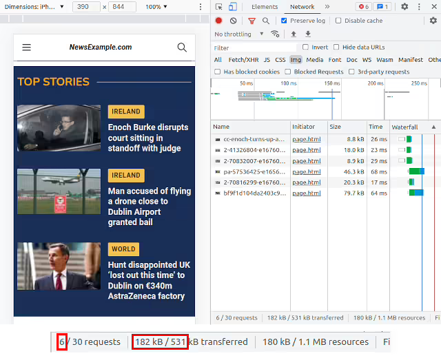
The images required have been reduced from 14 to 6, with the amount of data effectively halved (360kb -> 180kb). This leads to much faster initial loading, with the later images only loaded as and when they're needed by the user scrolling.
This is a big improvement! But hang on a moment - this still looks like a lot of imagery for a page we haven't scrolled on yet. The main images in the viewport are expected, as well as perhaps one more just below the fold, but we still seem to be loading a few more images than expected. Let's look a little bit closer..

Section header with background image
Scrolling further down the page, we can see a "World News" banner, with a background image. The source of this image is one of the rogue ones in our initial network panel view, and is being loaded unconditionally.
<div class="header-container">
  <h2>World News</h2>
</div>

<style>
  .header-container {
    background-image: url('bf9f1d.....png');
  }
</style>
loading=lazy is great for the src value of an image, but what about background images? These are typically declared via a background-image:url() css rule, which can't currently be controlled by a loading attribute. How can we lazily load them?
IntersectionObserver
This JS-based object is similar to the old js-based plugins hooked into scroll events. It is still often found as an alternative implementation to the loading=lazy strategy mentioned above. As the IntersectionObserver is implemented directly at browser level, it's more efficient than hanging off a scroll listener, but conceptually does the same thing - wait until element X is in/near to the viewport, then do action Y.
<!-- Lazily loading images in browsers without loading="lazy" support -->
<img data-src="image.jpg" class="lazyload" />

<script>
  function handleIntersection(entries) {
    entries.map((entry) => {
      if (entry.isIntersecting) {
        // Item has crossed our observation
        // threshold - load src from data-src
        entry.target.src = entry.target.dataset.src
        entry.target.classList.remove('lazyload')
        // Job done for this item - no need to watch it!
        observer.unobserve(entry.target)
      }
    })
  }

  const images = document.querySelectorAll('.lazyload')
  const observer = new IntersectionObserver(handleIntersection)
  images.forEach((image) => observer.observe(image))
</script>
The above code will load the src of the image as soon as it comes into view.
Using an IntersectionObserver to load an image
An important note here is that often we don't want to wait until an image container is within the viewport to trigger loading. Loading images takes time, and the delay can be perceptible to the user. Ideally we want to start the image loading process when the container is close to the screen, likely to soon be in view, but not quite there yet. For this, we can use the rootMargin of an IntersectionObserver. This is a property which uses CSS values to effectively extend the size of the container.
Let's say, for example, we want an image to start loading when it is 100px away from the viewport (in either direction - above or below the viewport). We can do this by adding a rootMargin value to the initialisation of our IntersectionObserver. This value works like a CSS padding or margin directive - 100px 100px 100px 100px can be compressed to a single value of 100px:
const observer = new IntersectionObserver(handleIntersection, {
  rootMargin: '100px',
})
The red dotted line indicates a 100px distance from the viewport
How can we apply this to our background image problem?
Lazily-loading background images
Let's take a div, with a background image bg.png. What we can do is split the CSS for this div into two classes - one containing all attributes except the background image (.header-container), and one containing just the background image (.header-bg-img).
<div class="header-container">
  <h2>World News</h2>
</div>

<style>
  .header-container {
    height: 150px;
    width: 300px;
    font-weight: bold;
    background-size: cover;
  }

  h2 {
    margin: 0;
    position: absolute;
    top: 50%;
    left: 50%;
    text-shadow: 2px 2px white;
    transform: translate(-50%, -50%);
    font-weight: bold;
  }

  .header-bg-img {
    background-image: url('bg.png');
  }
</style>
When the intersection observer intersects:
Add the
bg-imageclass to our main div. This triggers loading of the background image.- Remove the observer. This prevents repeat thrashing of the DOM.
if (entry.isIntersecting) {
  // Add class with background image
  entry.target.classList.add('header-bg-img')
  // Job done for this item - no need to watch it!
  observer.unobserve(entry.target)
}
Adding a class using an IntersectionObserver, with a viewport offset
That works really well. But in many implementations, we'll often have dynamic background images, and won't know them in advance in order to add them to our bundled CSS. An example here would be the creation of a TV-style blurred background effect for a given image. Is there an alternate approach?
Lazily loading background images using data attributes
We can support a more dynamic approach to assigning background images by making use of data- attributes. This allows us to leave our bundled CSS file alone, and set any required background images as data attributes on the element in question. This changes our process to:
- Add a
data-attribute to the div, such asdata-bgimage=x.png. Using an intersection observer, when this div crosses our threshold, set this
data-bgimagevalue to be thebackground-image:url()value.- Tidy up - unobserve the element which has had the background applied.
<div class="header-container" data-bgimage="bg.png">
  <h2>World News</h2>
</div>

<style>
  .header-container {
    height: 150px;
    width: 300px;
    font-weight: bold;
    background-size: cover;
  }

  h2 {
    margin: 0;
    position: absolute;
    top: 50%;
    left: 50%;
    text-shadow: 2px 2px white;
    transform: translate(-50%, -50%);
    font-weight: bold;
  }
</style>

<script>
  // Check for IntersectionObserver support
  if ('IntersectionObserver' in window) {
    document.addEventListener('DOMContentLoaded', function () {
      function handleIntersection(entries) {
        entries.map((entry) => {
          if (entry.isIntersecting) {
            // Item has crossed our observation
            // threshold - load src from data-src
            entry.target.style.backgroundImage =
              "url('" + entry.target.dataset.bgimage + "')"
            // Job done for this item - no need to watch it!
            observer.unobserve(entry.target)
          }
        })
      }

      const headers = document.querySelectorAll('.header-container')
      const observer = new IntersectionObserver(handleIntersection, {
        rootMargin: '100px',
      })
      headers.forEach((header) => observer.observe(header))
    })
  } else {
    // No interaction support? Load all background images automatically
    const headers = document.querySelectorAll('.header-container')
    headers.forEach((header) => {
      header.style.backgroundImage = "url('" + header.dataset.bgimage + "')"
    })
  }
</script>
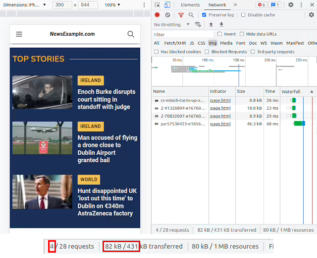
With this approach, we can lazily load background images, ensuring that our initial pageload is fast and performs well, while the overall user experience is unaffected. And we can see a marked improvement in our earlier page load - losing 2 more resources. In this example, it means we've now got a reduction of 75% on the images we were previously requesting on load!
Lazily-loaded background images removed from initial load
As background images can often be large, hero-style images, perhaps designed to stretch on a desktop screen with no mobile version provided, this lazy loading technique can bring significant improvements to page speed loading metrics.
What's next?
As seen above, improving the loading of our background images will make a significant difference to the loading time of our pages. Once we've done this, is there any more low-hanging fruit to help us quickly improve our page speed scores, and user experiences? Fortunately, there is!
Font Subsetting - shrink down font files to speed up page loads: My favourite part about this technique is that it can be done without making any code changes to the application. A big boost in page speed, and without changing code? Win-win!
Using Web Components for more effective video loading: Loading embeds like YouTube on-demand rather than on-load can have a huge positive performance impact, though there are some SEO considerations along the way.
Minimising Cumulative Layout Shift (CLS) when loading responsive ads: Ads are a necessary evil on many websites, so how can we ensure they load in the most efficient way possible?
Using a TV-style background blur to showcase portrait images in landscape layouts: Not strictly performance-related, but a nice visual touch we can add with minimal code, mirroring how TV news stations handle showing portrait videos on landscape screens.