
Using a TV-style background blur to showcase portrait images in landscape layouts
Often when we implement a layout, we're working from a beautiful design, but one where the main (hero) image is typically in landscape format. This works well in the majority of cases, but what happens when we need to showcase a portrait image in this space? What are our options for doing this in a way which looks good, shows the image in the most compelling way, and doesn't cause CLS issues from trying to accommodate the unexpected image size?
There are a number of different options we can try, all of which are thankfully limited to some light CSS changes. Funnily enough, TV news may have given us the best answer! With a small bit of CSS, we can achieve an eye-catching "blurred background" effect, similar to that seen on the news when a TikTok or Youtube vertical video is being shown.
Let's take a run through our options!
Option 1: Forced crop of the image
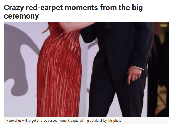
From a development perspective, the easiest approach is to keep a fixed-size container for the image, and force the portrait image to appear in landscape format. By setting the max width on the image, vertically centring, and hiding overflow from the hero image container, we can get this effect. It's quick, simple, but does not give us a great result - the resulting image is not going to be the same as the person publishing the content created.
In the best case scenario, it looks a bit off, as in the above example. The web is full of examples of worse outcomes - portrait photos of actresses at awards being zoomed in to show just their chest, or portrait headshots of defendants in court being cropped to sinister-looking close ups of their eyes. In these cases, the misleading image crop can give a very different context to that which the page is trying to convey.
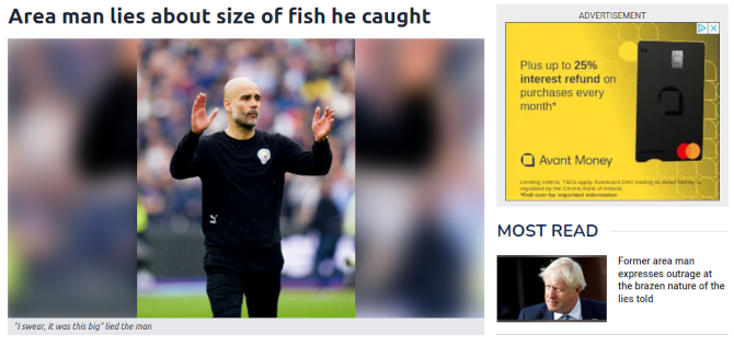
Option 2: Keep the height the same as landscape images, and use a plain background
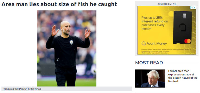
Here we use a <figure> to wrap our hero image and caption together. The hero-wrapper div around the image will act as a container, for whatever higher-level styles we may wish to apply. The margin: auto on the image means it'll end up centred within our container.
<figure>
<div class="hero-wrapper">
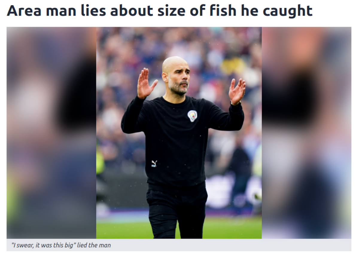
<img alt="Area man lies about size of fish he caught"
width="350" height="405"
src="portrait.png">
</div>
<figcaption>
"I swear, it was this big" lied the man
</figcaption>
</figure>
<style>
.hero-wrapper {
position: relative;
overflow: hidden;
}
.hero-wrapper img {
margin: auto;
}
figcaption {
color: rgb(31 41 55);
font-style: italic;
font-size: 0.75rem;
line-height: 1rem;
padding: 0.25rem 0.5rem;
background-color: rgb(229 231 235);
}
</style>
This option is better, as we now are showing the portrait image in full. However, the absence of a background doesn't look great, particularly when we have container elements like the caption going full width. We can do better.
Option 3: A background colour fill
Tweaking our previous CSS, we can add a highlight to the background of our hero wrapper:
.hero-wrapper {
    ...
    background-color: rgb(229 231 235);
}
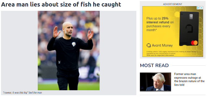
This is a little better! We've not got big open space any more, as we have added a subtle background fill. We have the option to go stronger here, with a colour more in keeping with the site branding, but in any case, we now don't have the image looking a little "lost" in a key part of our page.
The same background colour being applied to the <figcaption> and hero-wrapper gives the impression of a consistent background colour for the whole container.
This is now looking pretty good, and is a very acceptable result! But can we do better?
Option 4: A TV-style "blurred background"
For our next solution, we turn to TV for inspiration. It's increasingly-common to see vertical-orientation videos taken from TikTok, Youtube or Twitter, then shown on TV shows. The problem with showing a vertical video on a horizontal TV screen is identical to the issue we have with our portrait image on a landscape container - what do we do with all the empty space? TV producers realised that flat backgrounds don't look great, so have almost universally adopted a "blurred background" effect. But what image to use when creating that blurred background? In the TV case, they re-use the main video as it's own background image!
The blurred background effect is achieved by using a blown-up, blurred version of the main content as the background to the whole hero-wrapper container. That way, there is no worry about colour clashes between the main content and the background, and it's a much more engaging visual for the user. And the good news is that we can achieve a similar effect using only our existing image and a sprinkling of CSS!
<figure>
    <div class="hero-wrapper">
        <img alt="Area man lies about size of fish he caught"
            width="350" height="405"
            src="portrait.png">
    </div>
    <figcaption>
        "I swear, it was this big" lied the man
    </figcaption>
</figure>

<style>
    .hero-wrapper {
        position: relative;
        overflow: hidden;
    }
    .hero-wrapper::before {
        content: "";
        background-image: url(portrait.png);
        filter: blur(15px);

        background-position: center;
        background-size: cover;

        position: absolute;
        left: -15px;
        top: -15px;

        width: calc(100% + 30px);
        height: calc(100% + 30px);
        z-index: 0;
    }
    .hero-wrapper img {
        margin: auto;
        position: relative;
        z-index: 10;
    }
</style>
There are a number of changes to the CSS here, chiefly the introduction of a ::before pseudo-element to the hero-wrapper element. Let's break them down:
content:"": Setting the content to an empty string allows us to style the entire pseudo-element. Without any content set, the styles won't be applied.background-image: It seems counter-intuitive, but we're going to use the same file for the background image as we do for the main image.filter: blur(15px): This filter applies a Gaussian blur function to the image. The higher the pixel value, the more blurred the image gets. 15px is around the level most TV stations seem to use - the image is still broadly recognisable, but not so sharply-defined as to be distracting to the viewer. A lower number means a sharper image, while a higher number means an even blurrier result.background-position: centerandbackground-size: cover: These will center the image, and scale it to the smallest possible size required to cover the whole container, while preserving aspect ratio.position: absolute,left: -15px,top: -15px: This will position the blur holder absolutely, so it can spread over the entire wrapper div, but will later allow the image to be placed above it. The negativeleftandtopvalues are used in tandem with thewidthandheightvalues to ensure we get a fully edge-to-edge background image.width: calc(100% + 30px)andheight: calc(100% + 30px): Over-sizing the blur holder means that get a consistent image edge-to-edge, allowing for the 15px blur (15 on each side = 30px). Without the additional 30px, we get a halo-type effect around the edge, where the image is so blurred as to be invisible, allowing the background colour of the wrapper div to bleed through. With these settings applied, we get an edge-to-edge image..hero-wrapper img -> position: relative; z-index: 10: Now that the sibling blur div is absolutely positioned, specifying relative position on the image allows it to appear above the blurred background. An increased z-index means it will reliably appear above the background div, which has a z-index explicitly set to 0.
Now we have implemented a solution which is dynamic, eye-catching, and can be implemented using only a few lines of CSS!
While the above is only a few lines of CSS, Jeff Ochoa has highlighted that, if we're using Tailwind and the support it has for CSS variables, we can tighten the whole thing up even further:
.hero-wrapper {
    @apply relative overflow-hidden;
}

.hero-wrapper::before {
    content: "";
    position: absolute;
    background-image: var(--bg-img);
    left: -15px;
    top: -15px;
    width: calc(100% + 30px);
    height: calc(100% + 30px);
    filter: blur(15px);
    z-index: 0;
}

.hero-wrapper img {
    @apply z-10;
}

<figure>
    <div class="aspect-video hero-wrapper" style="--bg-img: url('portrait.png')">
        <img src="portrait.png" class="object-cover mx-auto h-full relative">
    </div>

    <figcaption class="px-2 py-1 bg-gray-200 text-xs text-gray-800 italic">
        "I swear, it was this big" lied the man
    </figcaption>
</figure>
Performance optimisation
This strategy works well for hero images, but what about if the image is being used further down the page (the middle of a long article, for example)? In that scenario, our image loading best practices would mean that our img has a loading="lazy" attribute to avoid unnecessary early loading, but at the time of writing (Feb 23), background-image doesn't yet support native lazy loading. What are our alternatives?
1. Use a smaller background image
One way to minimise the impact of loading a large image as a background is to load a much smaller one! Given the highly blurred nature of the image, having a scaled version of the image set as the background can mean that the image is still loaded, but at a cost of 3-4kb. In practice, a 450px high image can be shrunk to around 35-40px tall before the stretched and blurred version is noticeably impacted.
2. Lazily load the background image
Lazy loading of the background image requires javascript - either using an existing plugin, or attaching to something like an IntersectionObserver to apply a background image. In either case, they involve additional javascript being loaded on each pageview, so the trade-off versus using a smaller background image is worth considering. I've written a bit more about using an IntersectionObserver to lazily load background images, and the potential performance benefits involved.