
Improving Page Speed - Optimising for Core Web Vitals
Core Web Vitals are a series of metrics which attempt to put an objective measure on web page performance. They cover the speed of site loading, the way the page jumps around while loading assets, and how quickly a page can be used by a visitor. In short, they attempt to quantify how fast a page "feels". This data is gathered from real-world traffic, from users of the Chrome browser. These metrics will be used in the Google rankings for a page, so what are the common optimisations we can make to ensure our pages score well?
What are the key metrics to worry about?
In short:
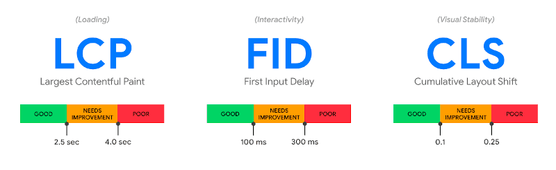
LCP - how fast does the largest item on the page load?
FID - how long until I can interact with the page?
CLS - how much does the page move around while loading?
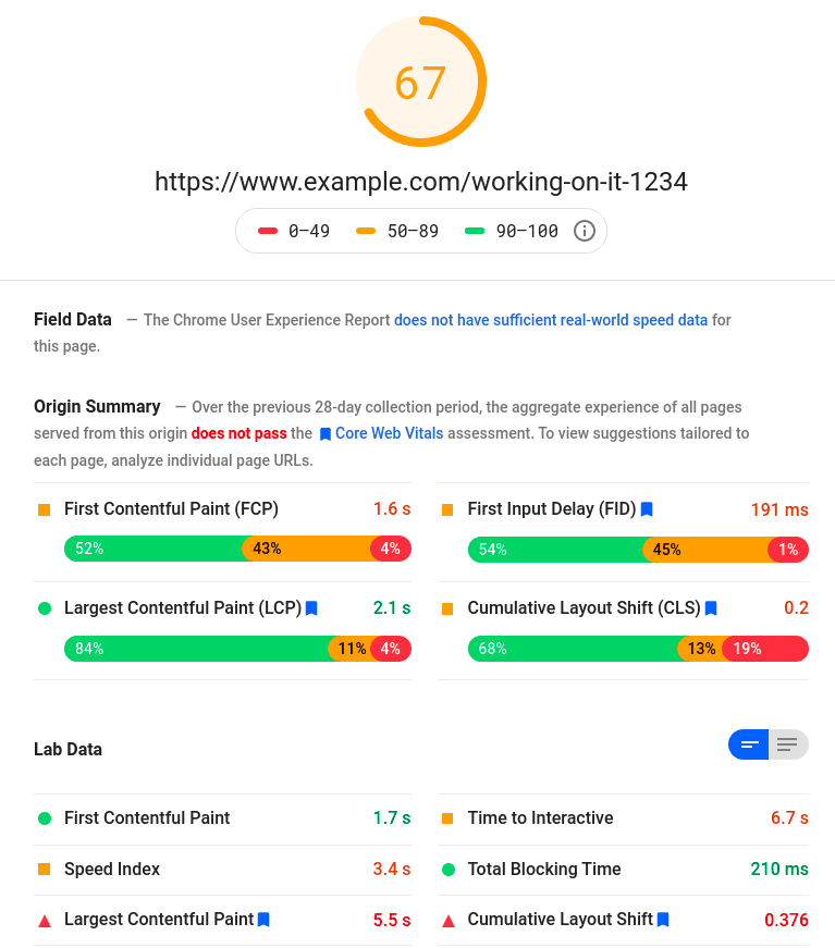
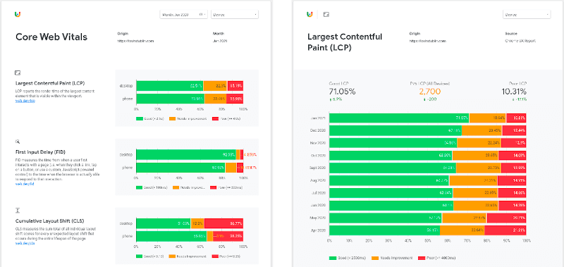
These metrics are visible through tools like Google's Page Speed Insights. This tool will give an aggregate page score, then show how the page scores on individual metrics, along with suggestions for improvement. If the given page hasn't seen enough real-world usage to build up a score, the "Origin Summary" will show the domain's overall score.
Why does it matter?
Google has announced that it will be using CWV scores as ranking factors as of May 2021. There is also the suggestion that pages determined to be fast (all 3 metrics in "good" state) will have an additional "fast" label added in search results, similar to the AMP icon on mobile search results.
Historically whenever Google have rolled out a ranking change related to speed or performance, they've made tools available for website owners to easily check their own scores, and in areas where they are deficient, flag it with their web developers. There are a number of practices which used to be either recommended or at worst had no impact on the score, but now actively are flagged as issues of concern.
There are a number of things we can do very little about when they impact page speed score - 3rd party embed providers with enormous Javascript bundles, for example. But there are a lot of things within our control which we can optimise. We'll dig into a few examples of this "low-hanging fruit" below! But before we start making changes, how do we measure the impact our changes will have?
How can I check the CWV score for a page?
There are several different tools to check the score for a page.
Google Page Speed Insights
The Page Speed Insights tool takes a given URL, and produces the report shown above, along with improvement suggestions. This report will run tests against a page, but also pull in real-world user data. Lab tests often show a better result than real-world users for ad-heavy sites, due to the variability of ads which can be shown, and their impact on loading.
It's important to note that the score can fluctuate quite a bit between successive runs. This can be due to different ad networks loading, slight changes in network conditions, different cache hit rate on the underlying page, varying performance of social media embeds, etc. When trying to gauge performance of an existing site, it's important to take the score from a number of similar pages across the site, with repeat readings taken, and a sensible average taken. The page speed tool will cache results for 30 minutes, so it can take a while to build up this initial score of a site to a reasonable degree of confidence, but the multiple readings ensures that we've a good idea of the quality of the page, and aren't misled by some outlier scores.
Chrome Dev Tools - Lighthouse
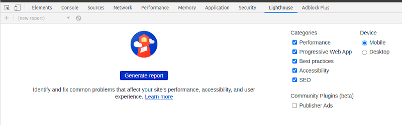
Within Dev Tools, there is a "Lighthouse" tab. This will run a test against whatever page is open in the browser, producing a report similar to the one Google Page Speed Insights one.
When working in local development environments, it's not uncommon to have additional debug tools running which won't run in the live environment. One example of this is the Laravel Debugbar, which is very useful for local development, but outputs a lot of html and javascript in its' reports, which won't exist on the live environment. It's best to ensure debug tools like this are disabled for these tests. Otherwise we get a lot of warnings for things related to those dev tools (large DOM, wasteful javascript) which won't be relevant in a live environment.
The same caveat applies to the scores here as to the Page Speed Insights site - repeated runs of the tool on the same page can produce varying results, so a sensible average should be taken.
Search Console
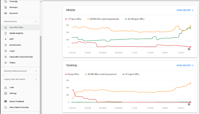
With the Google Search Console, aggregate metrics for a domain are shown, broken down by mobile and desktop. The "Open Report" link beside each device type produces a chart listing the specific issues found.

Each line item here is treated similar to an AMP validation error - clicking it reveals a list of impacted URLs, with the ability to click "Resolved Issue" when a fix has been pushed, in an attempt to trigger a re-evaluation.
A significant caveat here is that the data in GSC has a lag of potentially 30 days, so will generally not quickly absorb the impact of changes made.
Performance over time (Big Query + Data Studio)
The data collected from Chrome users is aggregated and published once a month in a publicly-accessible Big Query format. Typically the data for a month gets published between the 10th and 15th of the following month. This data can be queried directly using SQL-like syntax - there's a good tutorial on this here.
Big Query also gives us the ability to link with Data Studio, and create rich reports with a user-friendly visual layer. This can be useful for demonstrating progression over time to a client, or improvement after a relaunch. Data Studio reports can be published and the URL shared, or a PDF export generated. There's a step-by-step guide to creating these reports available here.
Due to the delay in data aggregation, this approach is more useful for on-going monitoring than immediate analysis of changes released.
What are the common improvements to make to a site with poor web vitals?
Depending on the site in question, there can be a lot of different optimisations required.
They can usually be bundled into a few groups though:
- images - as small and as fast as possible (LCP)
- layout - through CSS ensure that the browser has space available for all elements, and doesn't need to re-draw (CLS)
- javascript - minimise it as much as possible (FID)
- ads - ensure they've adequate space, and are loaded as efficiently as possible (CLS and FID)
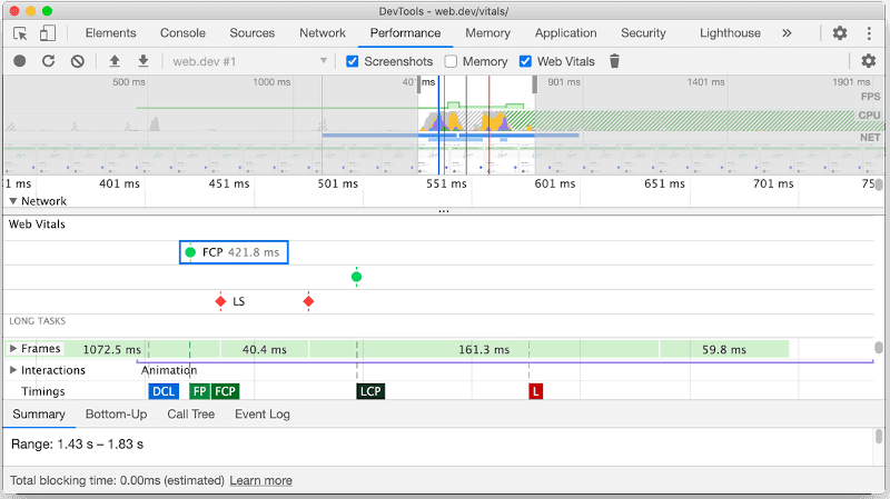
Also, when running a Performance recording in Chrome, the Web Vitals will be visible on the result.
Common Fixes - AMP
AMP pages are generally well-optimised thanks to the underlying toolkit, but there are changes that can be made.
Server side rendering
AMP can potentially be slow to start up, as it loads a master AMP js file, then runs it to figure out things like image sizes to be redrawn throughout the document. Server-side rendering is what Google's AMP cache does, and is something we can apply to our own sites relatively easily. The pre-rendering handles things like optimising the order of javascript files, setting preload conditions, and image sizing, all of which helps with First Paint and ultimately LCP. The AMP project make a number of tools available for this kind of rendering - a PHP example ishere.
WebP Images
WebP is an image format which has superior compression to JPG and PNG. In real-world cases, we see a drop of between 10 and 30% in filesize, with no appreciable impact on quality. Support for WebP improved significantly in early 2021 when Apple added it to the latest version of iOS - current support stats can be seen here.
While WebP is common, it's not supported globally, so we need to provide a fallback. AMP gives us the ability to do this within the amp-img tag.
<amp-img alt="My Image"
  width="550"
  height="368"
  src="images/example.webp">
  <amp-img alt="My Image"
    fallback
    width="550"
    height="368"
    src="images/example.jpg"></amp-img>
</amp-img>
With this code, the AMP runtime will attempt to load the webp image, but if it fails, load the jpg as a fallback. This allows us to serve small images to browsers with WebP support, while ensuring that browsers without WebP support show the images ok.
N.B. when testing any kind of image fallback, it's important to continually test the failure case (no WebP support). Older versions of Safari are good for this, but as of Chrome 88, this can be done within Chrome by disabling WebP support. When you've finished implementation, disabling WebP support, restarting the browser, and ensuring that all fallback images render where expected is a way of testing the fallback performs as expected.
Common Fixes - Web
AMP is a lot more restrictive than the traditional web - the much wider variety of options available for building a site gives us a much bigger set of optimisation options!
Preloading of fonts
When multiple fonts are in use, loading them can block the main thread. Adding a preload meta header for each font tells the browser to start loading these resources as early as possible, so they're ready when they are later requested in the CSS.
To ensure they do get loaded quickly, any preload call should appear as high as possible within the <head> block.
<link rel="preload" href="/fonts/my-font.woff2?v=4.6.3"
    as="font"
    crossorigin />
The as="font" is important - the browser needs to be told what type of asset is being loaded. This value is different for css and js files, and if the wrong value is used, the asset can be seen loading twice in the Network tab in Chrome dev tools.
The crossorigin attribute indicates whether the resource should be fetched with a CORS request as the font may come from a different domain. Without this attribute, the preloaded font is ignored by the browser.
Lazyloading of images
When an image is not in the viewport, loading it adds unnecessary weight to the page payload. Historically there have been a number of different lazyload strategies - using different js libraries, decorating markup in different ways (data-src instead of src etc), and then trying to fine-tune when the lazyloading activates, to avoid empty blocks on the page.
The loading=lazy attribute aims to change this, making it as simple as adding an attribute to a regular img tag, with no further alteration. Unfortunately, at the moment support for this is a bit like WebP support used to be - supported almost everywhere except for iOS and Safari. Usage of a polyfill enables us to keep markup simple, but still support older Apple-based browser engines.
A key thing to note with lazyloading of images is that it should not be applied to all images on a page. If an image is expected to appear within the first viewport ("above the fold"), it should not be loaded lazily, as often the flash will be perceptible to end users.
Web Font loading
When loading a custom font, by default there will be a moment where the text has loaded but the font has not yet. Depending on the CSS resets you're using, this will either look like blank space where the text should be and then it appears (Flash Of Invisible Text, FOIT), or the font will appear in the system style, then change to match the custom font (Flash Of Unstyled Text, FOUT). Both of these impact on user experience, with FOUT typically having an impact on CLS also. If the web font has a slightly different thickness or letter height, the amount of space taken up by text can change, causing a reflow in the entire document.
There are a number of different ways to handle optimising this appearance, using the font-display property. The two most common values to set are:
swap: Instructs the browser to use the fallback font to display the text until the custom font has fully downloaded. If the custom font is similar in size to the system fonts, this can be a quick way to avoid the bad user experience of FOIT, and minimise CLS.optional: This will tell the browser to try loading the custom font, but if it isn't ready in a very short period of time (~100ms), a system fallback font is used. This minimises CLS and LCP as by the time first paint is done, the font is either available or it's not. Used in combination with preloading, this can be very effective, but does run the risk of a slow connection preventing the custom font from loading, so a noticeable difference in UI may exist for users. This post goes into more technical explanation on this approach.
Using optional is the preferred option, if the fonts in use are fast-loading and there is not a considerable UI impact in the case where default system fonts are loaded. The swap option is safer in those cases where users have varying connection speeds, or we're struggling to deliver fonts effectively.
Self-Hosting Web Fonts
There are performance improvements to be had from self-hosting Google fonts. Historically the arguments against this have been that fonts cached on a Google CDN may already be in the user's cache (cache partitioning now breaks this assumption), and that Google automatically optimises by delivering the required font variant for the user's browser (woff2 standardisation means >95% of users are supported by one font type now). This post goes into a lot more technical info on why the previous best practice of relying on the remote CDN is no longer necessarily the best option.
Self-hosting can reduce the DNS lookups required and make initial loading marginally faster, assuming that the server is optimised to serve static files quickly.
Purge Unneeded CSS
In many applications, CSS is typically built on top of a framework (Bootstrap, Tailwind, etc). Even after minification, a large amount of the CSS is not needed - referring to classes that are never used in the final markup. The user's browser will still load all of this CSS, which wastes CPU cycles, and slows down initial loading and rendering.
Purge CSS is a tool which can be run over a project, and will automatically remove any CSS classes or ids which it does not find in the project markup. This can significantly reduce the size of the final CSS bundle.
One note of caution here is that Purge CSS will check for class names within markup files, but if a computed class name is used, it will not recognise it, and may strip it from the CSS. For example:
$alerts = [
  'danger' => 'red',
  'warning' => 'orange',
  'success' => 'green'
];
?>
<div class="alerts-<?php echo $alerts[$alert]; ?>">
In this instance, the classes alerts-danger, alerts-warning, and alerts-success would all be stripped from the compiled CSS, as Purge CSS isn't seeing that exact string in the markup. In these cases, we need to be a little more verbose, doing something like the below:
$alerts = [
  'danger' => 'alert-red',
  'warning' => 'alert-orange',
  'success' => 'alert-green'
];
?>
<div class="<?php echo $alerts[$alert]; ?>">
Inline Critical Path CSS
By default, the loading of CSS files will block any rendering on a page, slowing down LCP and FID. A way to improve this is to inline critical path CSS. What this means is to take the CSS which is needed to render the "above the fold" content, and to put it directly into the head of the document. The loading of the main CSS can then be deferred, giving it a lower priority and stopping it from blocking page rendering. This is similar to how AMP handles CSS.
There are a number of tools which will attempt to extract critical path CSS automatically, listed here. Typically only the critical path CSS should be inlined here, as any CSS here will make the document bigger, as well as slowing down the rest of the page, so redundant CSS here can be actively harmful. Aggressive use of CSS purging and tight code controls over CSS may mean that the overall site payload is small enough (2-3kb) to fit in here, but typically it's necessary to split out the critical path CSS for individual pages using the tools linked above, as different pages on a site will typically have very different rendering needs (homepage vs category page vs article page).
Ads
Ads are a consistent pain point when it comes to CLS and FID.
There are ad providers for features like video-based ads which only appear when the user scrolls past a certain point on a page, and then pop out, to follow the user as they scroll, causing the whole article to re-draw and impacting CLS. There is little that can be done about these ads, other than flagging them with the client that there is going to be an impact on CLS, and ultimately, page speed scores in Google. For many clients, the revenue from these units is high enough that it's a trade they're happy to make.
We have more control over the behaviour of traditional ad units, served through Google Ad Manager (DFP) responsive ad tags. The common scenario here is that a page loads, the ad request is made, content jumps to make space for an ad, and possibly jumps again if a different-sized ad is loaded, or shrinks back if no ad is loaded. All of these impact CLS.
There are two areas where this gets a little complicated - responsive ads, and clients who have very little inventory.
For responsive ads, we may support a variety of sizes. A leaderboard may support 320x50 on mobile, 728x90 on tablet, and both 7280x90 and 970x250 on desktop. In this case, using CSS we would set a min-height of 50px on mobile, 90px on tablet, and 90px on desktop. This would eliminate CLS on mobile and tablet, and would reduce the CLS on desktop to only impact times when a 970x250 is loaded, and in that case, only impact by 160px, not 250px. Depending on the client's typical campaign offering, on desktop they may usually set 970x250 with only occasional 728x90 ads served when no big campaigns were running. In that case, we would sometimes propose to them that we set the space to be 970x250 as a default, with the 728x90 centred inside an appropriately-coloured container for the rare cases it loads. We're always trying to optimise the common case, so it's important to know what the client's typical ad serving stats would look like.
For clients who have very little inventory, historically their ad slots will have been collapsed to avoid taking up space. With the advent of DFP-based lazy loading, this isn't widely supported, but for simpler DFP implementations, it is still often a request. Additionally, the way we design sites to avoid Google Ad's 2-click penalty means that there should always be an Ad label and colour-contrasted container around ads, so collapsing slots should be a minority issue, but is covered here as it will still come up with older implementations in particular.
In these cases, CLS suffers as, for example, we:
- Load up a site homepage, then fire ad tags for a top of page leaderboard.
- We've no min-height set, DFP tries to load a 970x250 ad, so sets the ad height to 250px - first CLS penalty incurred.
- No 970x250 ad can be found, so the ad container shrinks back to zero, moving all of the page back up 250px - another CLS penalty incurred.
In these cases, the best thing for a publisher to do is to decide what ad slots they do and do not want to use (over time, many ads slots fall out of sales plans but are left in the code). Once the ad slots are confirmed, setting up house ad campaigns is the next step. A house campaign is an ad campaign with low priority, which serves when no paid ad can be found. These typically are for internal promotion (newsletter, podcast, general brand awareness) and act as "filler" for ad requests. They mean that we can guarantee an ad will always be served in each slot. Once this campaign is running, we can then apply the min-height constraints to each ad slot, minimising CLS sitewide, while avoiding empty blocks in the page layout.
For a more in-depth article on technical solutions to this problem, I've written up some guidelines on minimising CLS when loading responsive ads.
WebP Images
The same argument applies for WebP images on traditional web as on AMP, outlined above. The syntax for handling a fallback is slightly different. One option is to use Javascript to detect browser support for WebP, and swap image source attributes accordingly. But our goal here is to increase page speed, which typically involves removing as much Javascript as possible, so we want to use native HTML structure where possible.
<picture>
  <source srcset="logo.webp" type="image/webp">
  <img src="logo.png" alt="Site Logo">
</picture>
In the above example, the type="image/webp" hint means that only browsers which recognise the image/webp MIME type will attempt to load that image. Any other browsers shall fall back to loading the png version.
Javascript and CSS Audit
Wordpress sites in particular suffer from huge amounts of Javascript and CSS files loaded on each request, with many plugins loading multiple files each.
In an ideal world, we'd have perhaps one JS file, and one CSS file. This isn't always going to be practically possible, so make sure to analyse the app to see if there are any plugins or files which aren't critical, or could be replaced with a small bit of custom code.
On Wordpress sites, there are plugins which attempt to bundle up the CSS and JS files to minimise the blocking of browser threads on render. These plugins tend to have mixed levels of success - if one CSS or JS file from one plugin is written in a way which makes it incompatible with concatenation, it can break the whole thing. Trial and error is required to find the right plugin for your particular Wordpress site and plugin combination.
Be careful how much Javascript is being called on page load or document ready. Things like loading social media Javascript to ensure embeds load consistently may have once been a relatively benign way to cover up for malformed embeds entered by users, but is now actively harmful, and should be replaced by either event-driven triggering, or ideally content being validated for the correct form on data entry.
Use Native Javascript Where Possible
In the past, libraries like jQuery and foundation were great at enabling simple, cross-browser Javscript to be written for non-trivial functions. The plugin ecosystem is similar to Wordpress, with nearly any problem having a few jQuery libraries available to solve it. However, similar to the problems Wordpress has, these plugins are of varying quality, and can significantly impact the execution speed of the site.
Over time, the best ideas from these libraries have mostly been standardised and brought into core Javscript standards. Toggling classes on an element, adding/removing nodes from a page, AJAX calls, managing events on DOM nodes - these are all possible now with simple, small bits of native Javascript, with a huge reduction in the amount of code required to run the site.
YouMightNotNeedjQuery.com is a little outdated now, but gives many examples of short code samples to replace common jQuery operations, with support going all the way back to IE8.
The fastest Javascript is no Javascript, but if it must be used, try to go native as much as possible!
User-generated Content
Dealing with user-generated content can present a number of challenges to our optimisation attempts. Whether it is users posting on a message board, or content being created in a CMS, giving users the ability to generate content means we need to take a few extra steps to ensure that our optimisations are applied to this content also. For example, when there are images added to a CMS by a user, we typically just render them as img tags. This can lead to both CLS and load issues when there are enormous images uploaded, and we're html-scaling them.
One approach is to apply a constraint in the CMS to reduce the size on upload to whatever the max size we might need on desktop is. This helps, but still usually results in too large an image - think of a site which needs to support wide images in a header and has a narrow article body, where each image could potentially go in either slot. We end up with an image wide enough for the header in the middle of the article.
A more robust way of handling this is:
- Run a formatter over the content to be outputted within an article, looking for img tags.
- Using DOM manipulation, swap these img tags out for ones using an on-demand image resizer, with a max constraint on the width, to ensure it's not wider than the article container (for responsive images, wider at each breakpoint).
- Add in a WebP variant, and native image lazy loading.
This can be a really effective of improving both CLS and overall load time for articles with many inline images.